making the digipak
When making the digipak I faced many challenges, as I had not previously used Photoshop and found it could be very tricky at times. However, I soon became more confident and was challenging myself more frequently when creating my product.
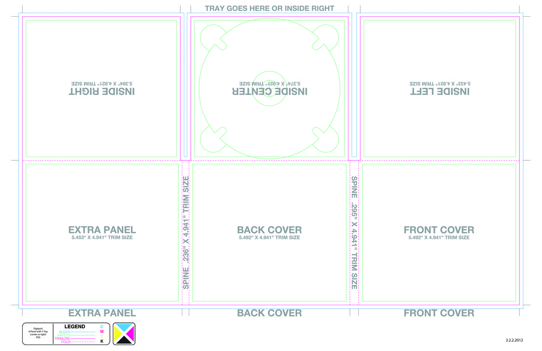
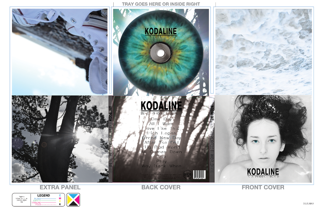
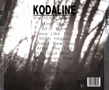
I used a six-sided template when making my digipak. This featured a front and back cover, a disc tray, two inside panels and an extra panel. Once I had my initial ideas for my digipak, I began taking pictures and experimenting with images to use for my digipak. I decided that the front cover would be the same as my poster, as it would create a synergy and the audience would be able to establish a connection between the products. The three other panels would feature shots of the locations in my music video, and the inside center would have a lens flare, which would create a halo around the disc tray, which would have my protagonists eye on.
changing the colour of images
Something I had to learn when creating my digipak was how to change the colour of an image. This helped to create a synergy between all the photos, as I could manipulate the colours so that they all matched the colour scheme.
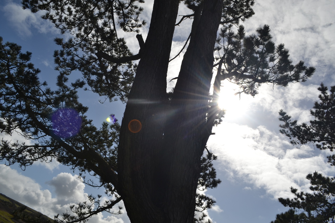
original photo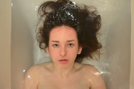
|
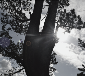
colour change
|
I changed the colour on my front cover as I wanted to bleach the colour to make her look ghostly; this represents how her life has been drained, and she feels as though she has nothing left. By putting the subject in black and white I was able to create a layer mask of her eyes, and change the contrast to make them vibrant and stand out in the photo. This suggests that there is still some life inside of her, and that she is fighting against society to bring back her happiness and control over her life. It also focuses on the eyes, which is a key image in my music video and other products.
|
|
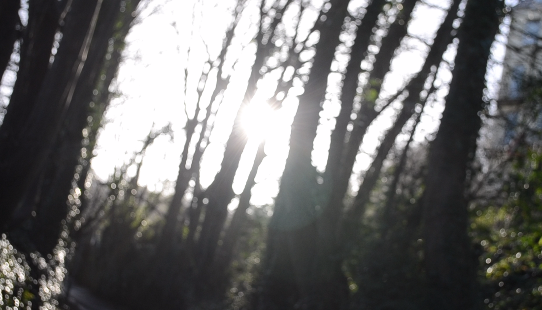
In order to keep a synergy with the front cover, the colour of the back cover needed to be subtle, with contrasting colours. I therefore decided to use a black and white effect, but to change the opacity of the effect so that it was not completely without colour, but enough to keep synergy with the front cover whilst also being artistic and serene. The lens flare creates a contrast to the trees, almost as though they are in silhouette, making the image eye catching and visually effective.
|
|
SImilar to the back cover, I wanted the extra panel to keep to the colour scheme of the other panels. I therefore changed the hue and saturation so that, like the back cover, it was slightly less vibrant, but still appealing. The lens flare again creates a contrast in the colours of the image, allowing it to stick to the colour scheme of the digipak.
